The new setting of the building has been revealed, designed with 70 international brands
The new setting of Archiproducts Milano has finally been revealed. For the 2018 edition its design has been dictated by colour and three-dimensional patterns experimented onto different materials. During the Milano Design Week thousands of people – among them architects, companies, journalists and specialised public – have visited the great appartment at via Tortona No. 31 fitted out in cooperation with 70 international brands.
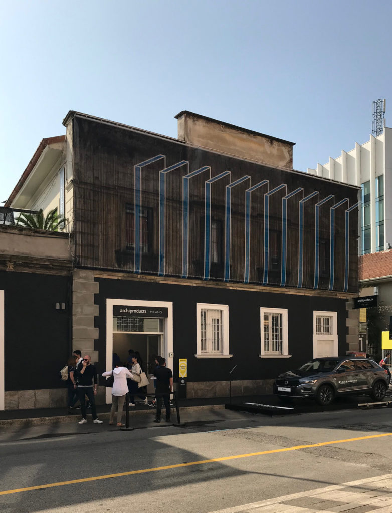
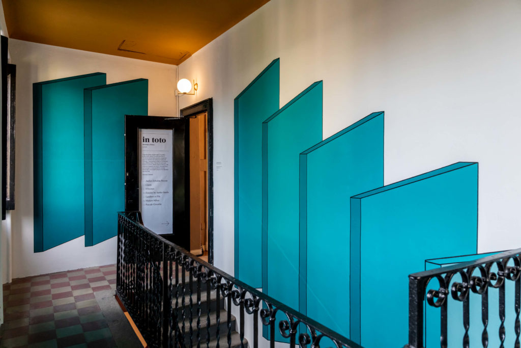
The project has been designed by many professionals:the Elisa Ossino Studio, that designed the new façade pattern, also reproduced onto the stair bringing to the upper floor of the building, and two other rooms inside.Studio Milo for the space granted to Saba Italia; Christophe De La Fontaine and Aylin Langreuter for the space Dante Goods and Bads, in co-branding with Cedit and One Mario Sirtori; Veronica Leali and Matt Lorrain for the space granted to SP01.
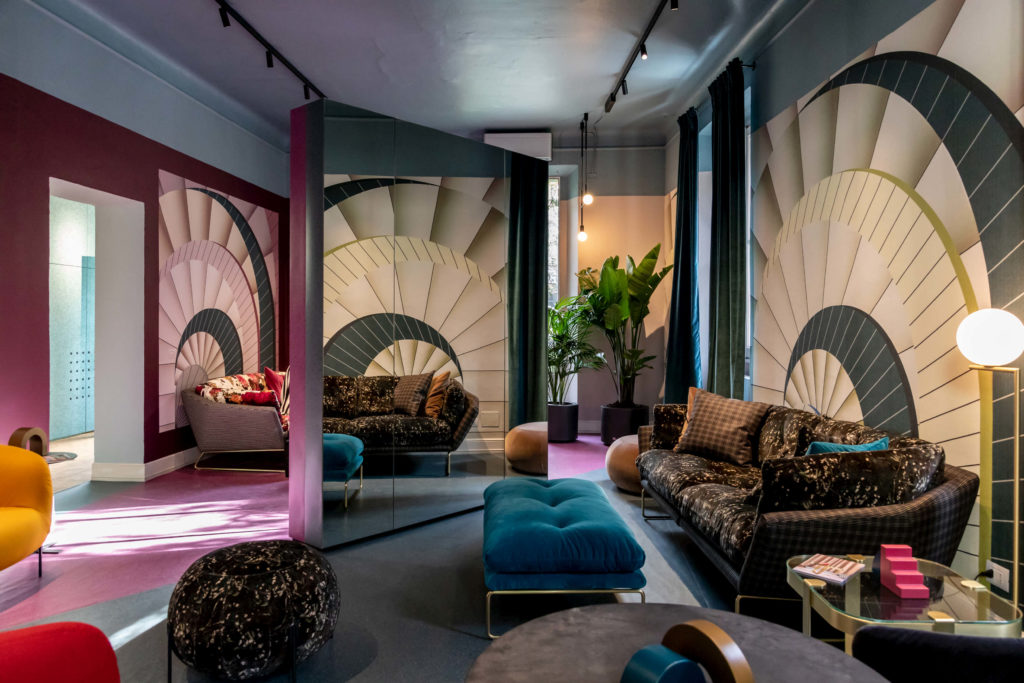
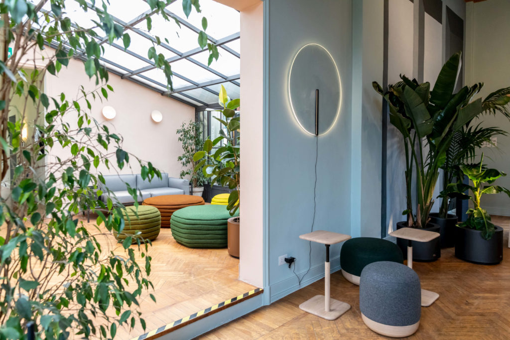
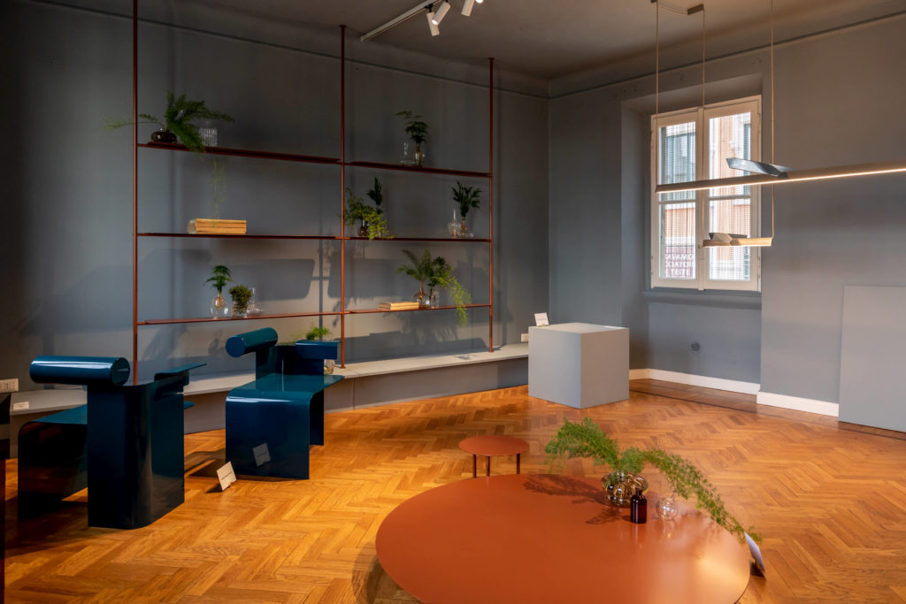
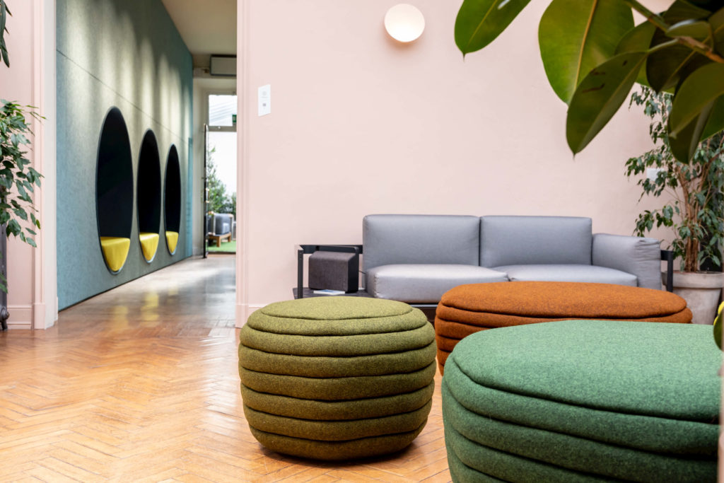
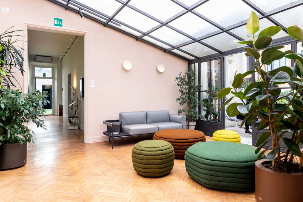
A key role in the design of this new edition was played by colour, that from the walls to the fabrics and pieces of furniture completely redesigns space, even if in a gradual path that, although shy and rigorous in some areas of the building, sometimes reveals a stronger identity and offers an experience you can completely dive in.
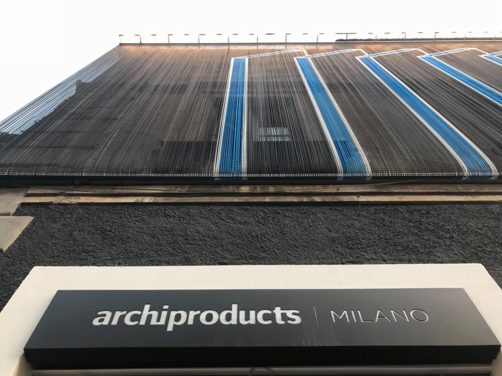
Black, silver and blue are the colours of the hundreds of very light anodized aluminim chains by Kriskadecor giving shape to the three-dimensional drawing on the façade made by the Elisa Ossino Studio.
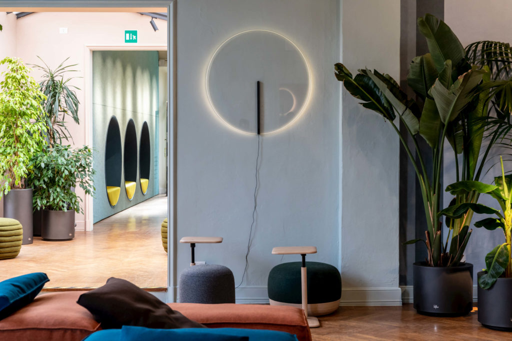
Rigorous on the façade, the chromatic scale inside is made up of several pastel nuances, from powder pink to petroleum blue going through sage green. Each room has a different colour, realised in cooperation with the German brand Caparol Icons and the very young File Under Pop with its studio in Copenhagen, founded by Josephine Akvama Hoffmeyer, whose colour palette is present on some areas thus giving them a stronger chromatic mark.
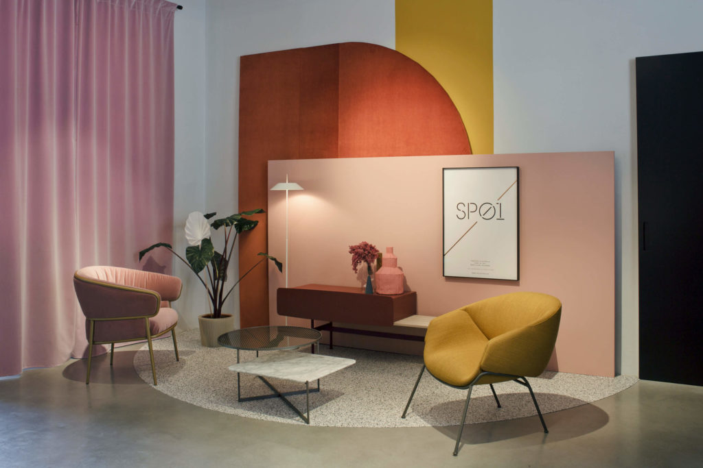
The young Australian brand Sp01 presents the new collection designed by Tim Rundle, combining industrial materials such as steel pipes with cone-shaped glasses, brass, pewter and luxury coatings for padded products. All the pieces of the collection are divided into three different sets, where fabrics, walls, floors and ceramics three-dimensional surfaces designed by Cedit and hung like paintings onto the walls communicate one another inside the same chromatic palette.
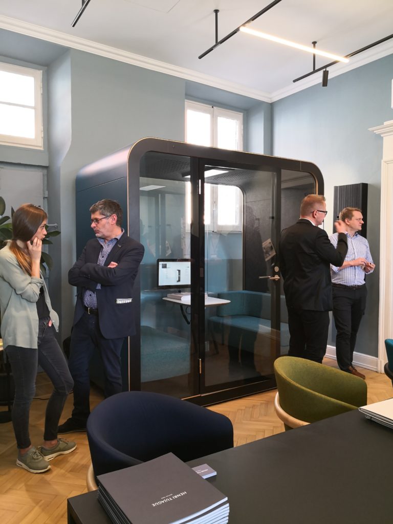
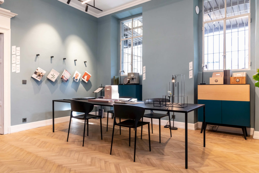
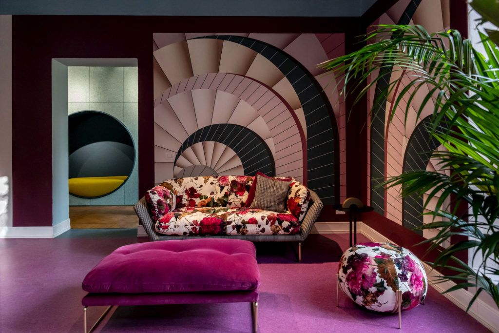
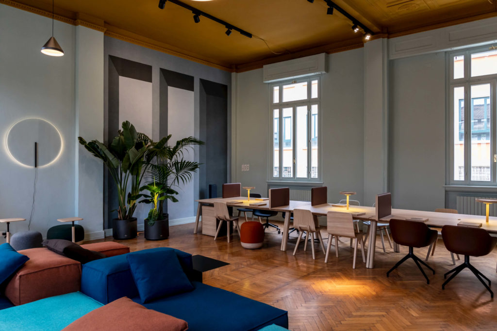
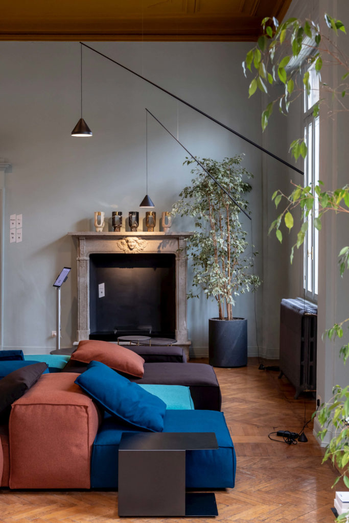
Bright and vibrant plays of colours characterise the big hall with the fireplace, where a long table by Alki is located under the high windows and in the middle of the room you can find a rich composition of the Extrasoft sofa by Living Divani, surrounded by a series of small tables to work in an informal way.
Here colours are mainly divided into two strong parallel lines. Their presence onto the walls creates a ‘trompe l’oeil’ effect thanks to the wallpapaer by Texturae, able to visually widen space and to constantly remind of perceptive plays between a two-dimensional and a three-dimensional vision characterising the areas designed with the help of the Elisa Ossino Studio.
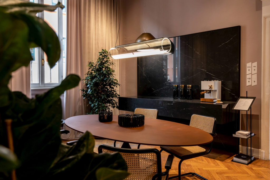
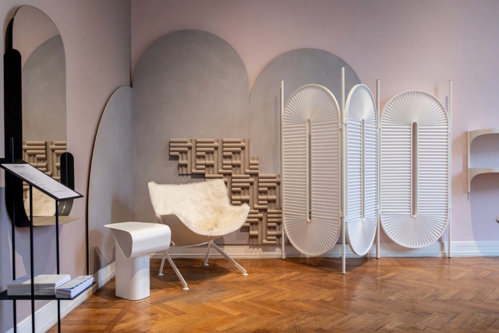
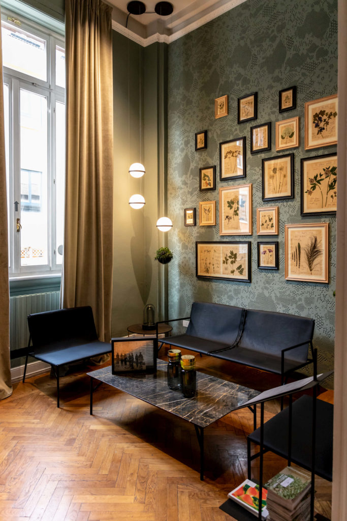
The path ends on the first floor with the smallest, but also the brightest room of the building in its new total-green look. An intimate and comfortable space, ideal for reading or for informal meetings, that welcomes the bookcase, chairs and small table by Casamania&Horm. The biggest wall hosts an original composition of herbals of natural flowers, unique works made by Officina Naturalis with an artisanal wooden frame. The black nuance of the furniture and frames marks an elegant contrast with the intense sage green of the walls and the bright velvet of the curtain made by One Mario Sirtori, whose fabrics furnish the whole first floor of the building, from the precious velvet curtains to the coatings of the several pieces of furniture specifically designed for Archiproducts Milano.
The lighting system hung onto the ceiling of the entire building is designed by Flos, with Infra-structure by Vincent Van Duysen on the ground floor and the brand new system The Tracking Magnet Surface by the Architectural Collection on the first floor. The decorative lighting is designed by Vibia, whose latest indoor and outdoor collections light almost all rooms on the first floor up. This year also the Australian brand Volker Haug Studio, lighting up part of the space granted to Saba, the German brand Luctra and the English Astro Lighting are partners of the project.
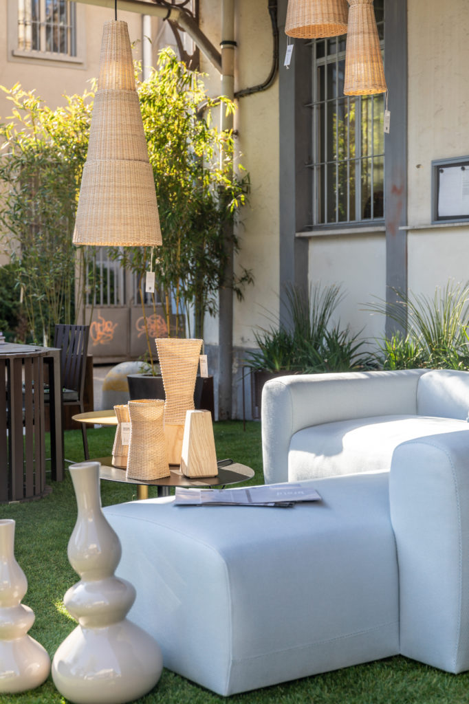
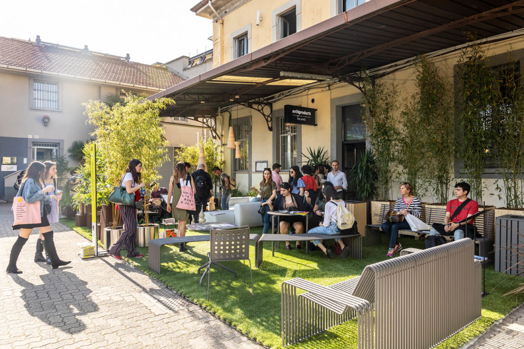
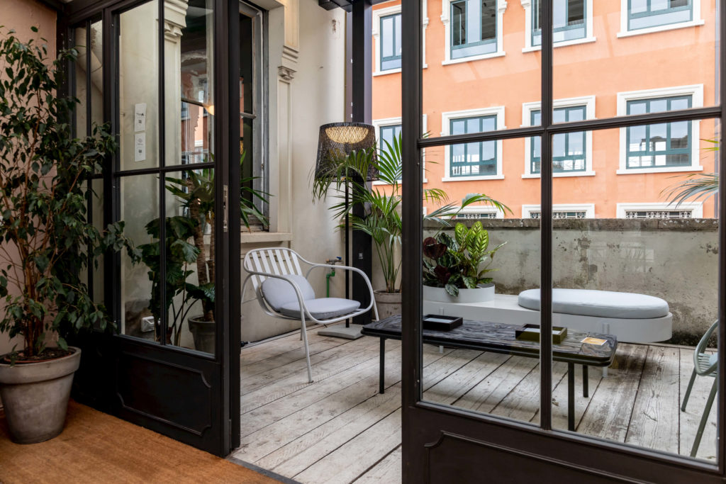
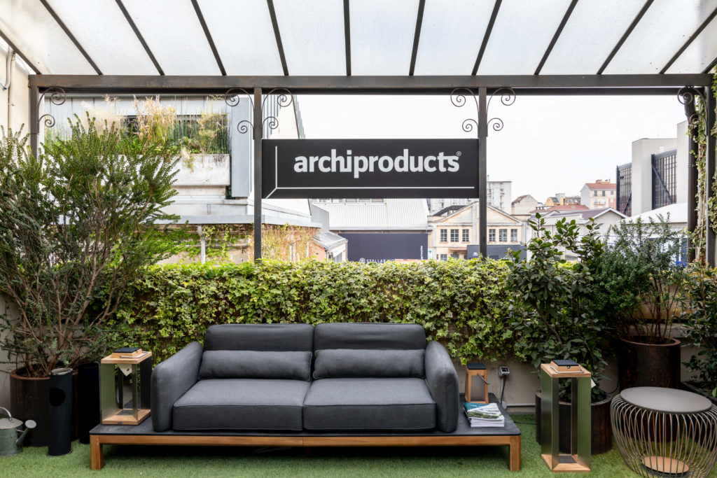
Last but not least, inside the court of Opificio 31, two outdoor areas welcomed visitors, respectively fitted out with the new collections by Braid together with the hand-made lamps by Bottega Intreccio and the collection of urban furniture Urbantime by Diemmebi, designed by Alberto Basaglia and Natalia Rota Nodari.
PARTNERS
Alki, Astro Lighting, Bottega Intreccio, Braid, Bticino, Casamania, Cedit, Daikin, Dante – Goods and Bads, Desalto, Diemmebi, Domal, Ekinex, Esemplareunico, Falmec, Florim, Florim Stone, Flos, Framery, Giovanardi, Henri Tujague, Hobby Flower, Horm, Kiasmo, Knauf Amf, Les Jardins, Living Divani, Luctra, Mogs, Monolithe édition, Officina Naturalis, ONE Mario Sirtori, Ooumm, Paola Zani, Roofingreen, Saba, Scirocco H, Soil, Sp01, Tarkett, Texturae, Thonet, Vibia, Volker Haug Studio, +d.
IN TOTO / Montreal in Milan: Atelier Zébulon Perron, Claste, D’Armes, Foraine by Atelier Barda, Lambert et Fils, Maison Milan, Pascale Girardin
TECHNICAL SPONSORS
Aeg, AnZa., British Fires, Cantele, Caparol Icons, Ever Life Design, File Under Pop, Ideal Work, Knauf, Kriskadecor, Kristina Dam Studio, Linvisibile, Martin Design, Oikos, Sayduck, Sûrface, Tivoli Audio, Velux, Vifa, 101 Caffè.
