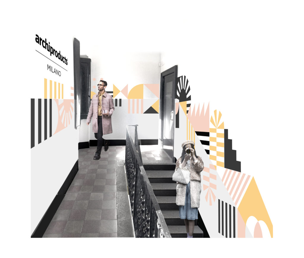
13/04/2017 – Urban installation, exhibition event, digital interactions and virtual reality in the same location,
Archiproducts Milano, for a new ‘design experience’.
Elle Decor interviews
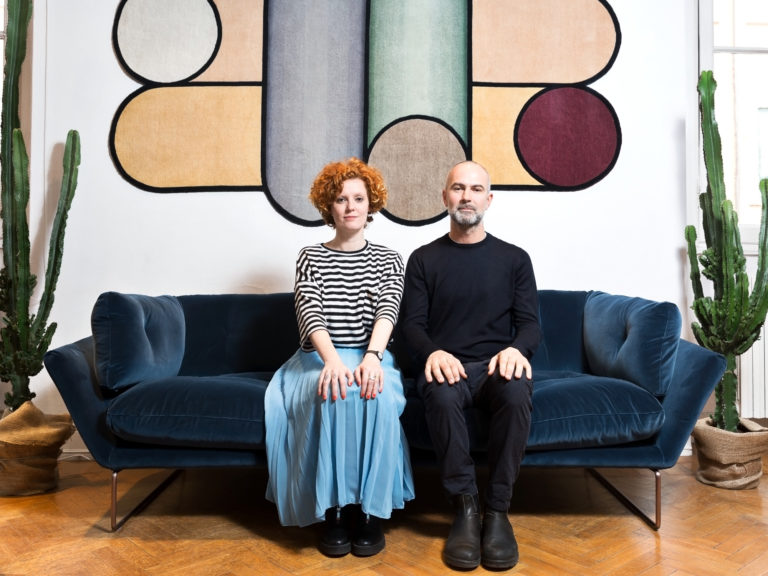
Enzo Maiorano, co-founder and art director of Archiproducts, and the designer
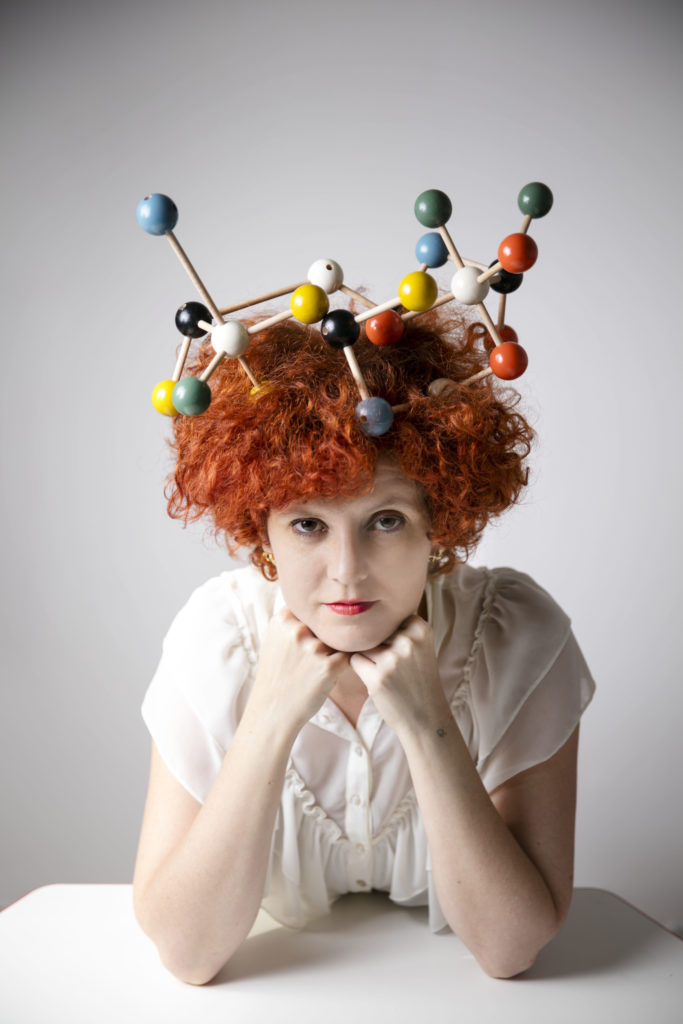
Serena Confalonieri, author of the new façade pattern of the building. Here the text of the interview by Caterina Lunghi.
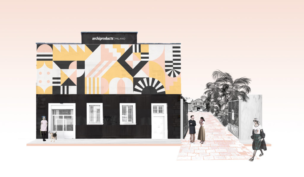
Milan, Archiproducts in via Tortona 31. On an old façade, a cascade of small aluminium chains composing a graphic pattern of colours and shapes – gold, black, and pink – catches the eye of the visitors of the current edition of the Milan Design Week. It is Archiproducts’s business card for the Fuorisalone: architecture, design, digital world, and, of course, physical space. It is one of the liveliest communities in the international scene, and a reference point for companies, builders, and designers.
An online platform (
Archiproducts), a space in Milan, in the heart of via Tortona (photo above), in front of the Mudec, and an app to see the products and the design objects also in 3D (Archiproducts Scan). The project is among the excellences of this year’s Salone del Mobile: an immersive and total experience in the design world.
Cofounder and art director Enzo Maiorano, and Serena Confalonieri, designer, author of the work on the façade, tell us more about it.
Let’s start from the exterior. Serena, can you explain to us the idea of the façade?
It is a composition of shapes and colours that represents the universe of Archiproducts.
I worked with architectural blocks, the same you use on Autocad: doors, arches, and other elements, on scale and on prospect. The design is the fruit of the combination of all these signs, and, through the colours, I came up with this abstract geometry.
Two levels of perception, the first is easy on the eyes and the second is for insiders?
Exactly, at every glance and in every corner you can find architectural elements. And I had to respect the Archiproducts’s identity, so I used yellow and black, its colours, and its language, that of architecture.
Enzo, why yellow and black for the identity of Archiproducts?
Because they are the colours of emergency and safety signs in construction sites. Our roots are in the construction business.
Enzo, let’s step back, can you explain to us the Archiproducts Milano space?
It is the arrival in town of Archiproducts, a shabby, without the ‘chic’, office! 800 Sq m and the concept is: once a year we empty the space, and we use it to show products and ideas of our associated companies, and in 2017 we present 40 of them. This new event at the Fuorisalone becomes the inauguration of the new setting for this year. A physical location that expresses the wide network of Archiproducts. It is Archiproducts online landing on Earth.
Let’s step even further back. You said: Archiproducts online landing on Earth…
Yes, Archiproducts is an online platform market place connecting producers and designers I founded 18 years ago with Ferdinando Napoli, to facilitate commercial relations between companies and professionals. We have thousands of participants, from technical products to decoration, lightning, walls, and furniture. And we also provide an e-commerce selection.
How do design and on-line work together?
Just think that we have a 1000% increase every six months. It is pretty much an avalanche.
And then this location… an opposite path, from online to the street…
Exactly, it is the path we are following: from the web to the city. Both are essential. We opened last year, we entrusted Diego Grandi with the façade (read also Archiproducts Milan Live, Work, Design). This is our second Fuorisalone, and we invited Serena Confalonieri to work on the exterior.
How does this space function during the year?
It is a showroom, but not just that: training, meeting, co-working, presentations. Designers can meet thousands of companies. The ground floor is dedicated to the launches of products you can then buy online: you can see and try them live and, with our partner Sayduck, we created the Archirproducts app, which works like Shazam, with details and information about the items.
So, it is another experience?
Yes, we also play with virtual reality and 3D, you can visualise the products within the rooms and arrange them before buying. Here is the theme of our Fuorisalone: The Design Experience. You come here and you can experience the products fully. This venue in Milan is only the first of a series of hubs.
You want then to broaden your horizons?
Yes, we already took an office at the Dubai Design District. In May, we’ll go to New York, we are scouting with Icff and New York City for Design for an American opening.
We are halfway through Milan Design Week. How is it going, Enzo?
We are in full swing, until yesterday (Wednesday, ed) we had more than 5,000 visitors. Last year, for our debut, we received unanimous support, but this year is even better. And also the Duetti/Duelli (Duets/Duels) we host everyday are going extremely well.
Duetti/Duelli… its sounds captivating… what is it about?
These are chess games on drawing, graphic performances: a project in balance between design and drawing curated by our friends Francesco Moschini and Francesco Maggiore for A.A.M. Architettura Arte Moderna. Architect Vincenzo D’Alba, armed with pencil and paper, deals with many other creatives, so far we had for example Marc Krusin, Paolo Rizzatto and Atelier Biagetti. The next round is scheduled for the morning of April 7, with Antonio Marra; we are then expecting Mario Bellini and Stefano Giovannoni… and maybe, if he can make it, also Tom Dixon will come over.


