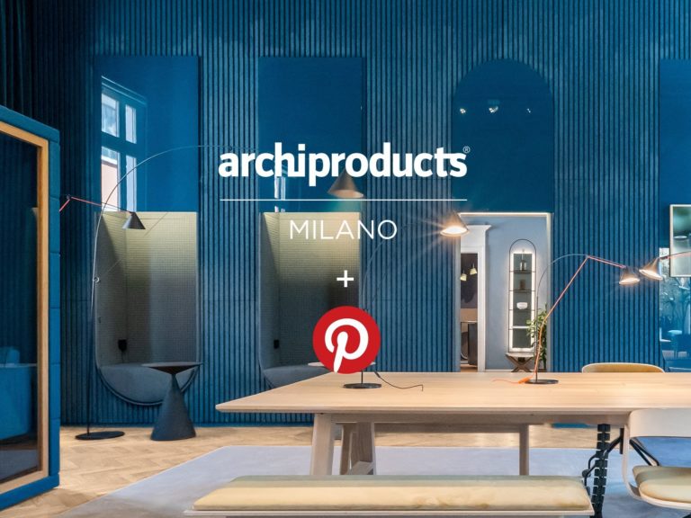
Archiproducts and Pinterest Together at Milano Design Week 2021

Pin Idea in every room in via Tortona 31 let visitors ‘copy’ the looks and buy the products online on Archiproducts

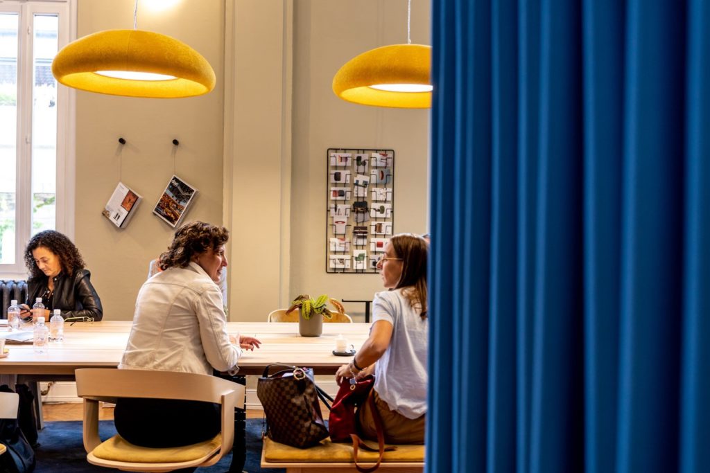
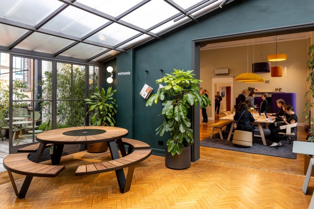
Pinterest comes to Archiproducts Milano for 2021 Milan Design Week. Anyone looking for inspiration can come to via Tortona 31 to enjoy a total Phygital experience. Pincodes in every room let visitors access information about the products on display, which can also be purchased on the Archiproducts platform.
Let’s get Phygital!

Archiproducts Milano imagines the space of the future in this year’s project/installation entitled Future Habit(at). The “future of living” is an important topic for the retail world with a furniture sector showing a marked shift towards e-commerce. Does this mean that the physical store will disappear? Archiproducts wanted to respond by exploring the potential of a more “phygital” customer experience – in collaboration with Pinterest, the world’s leading visual discovery engine for anyone looking for inspiration.

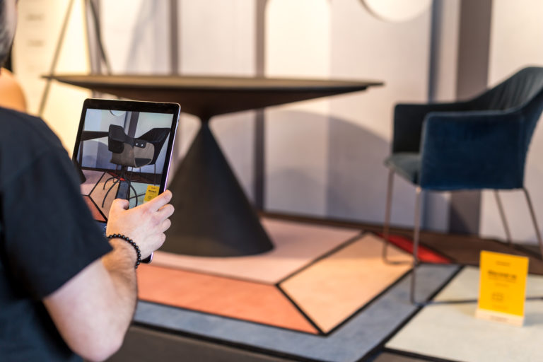
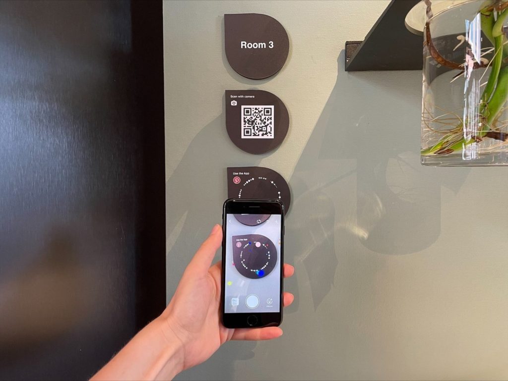
Each of the fifteen rooms in Via Tortona 31 will be outfitted with Pinterest’s personalized Pincodes that visitors can use to discover the new exhibit  – room by room, product by product.

How will interaction with Pinterest work? Visitors open the Pinterest app on their devices and scan the Pincode using the camera displayed in the app’s search bar. They then access the board dedicated to the Pin Ideas for that room. This is one of Pinterest’s latest innovations. Pin Ideas are a new kind of multi-page Pin that allows creators to share inspirational content in an exciting and immersive way through videos, images, descriptions and more. Each Pin Idea provides all the information about the products on display in the room. In just a few clicks, users can shop on Archiproducts and “copy the look”.  Archiproducts Milano 2021 – Future Habit(at) – PincodeCreated in collaboration with Studio Salaris and 60 international brands, this year’s Archiproducts Milano installation was created with the desire to anticipate scenarios that interpret future lifestyles. The keywords for this new edition are technology – increasingly silent and devoid of traditional interfaces – and cocoon spaces – opportunities for shared intimacy.

Collaboration with Pinterest – the visual discovery engine with over 450 million monthly visitors and million Home Décor, Design and Architecture searches every month – is one of the many initiatives promoted by Archiproducts Milano this year. The goal is to create an interactive and multimedia journey to the soft side of technology, previewing new ways of understanding shared space in today’s ‘new normal’ in pursuit of sustainability, aesthetics and comfort.

Partners
Abitex, Ambientec, Andlight, Astro Lighting, Bedont, BloomBoom, Braun, BTicino, BuzziSpace, CEDIT Ceramiche d’Italia, Centrsvet, d’Armes, Desalto, dooor, Econyl®, Elmar, Faema, Florim, Framery, Garda Furniture, Hobby Flower, Interna8, Kriskadecor, Midgard Licht, Milla&Milli, Meural powered by Netgear, Nicoline, Novacolor, Olimpia Splendid, Paola Paronetto, Paolo Castelli, Real Piel, Re-Volt, Samsung Climate Solutions, Samsung Home Appliances, Samsung Audio-video, Scirocco H, Serge Mouille, SilentLab, Slayer Espresso, Steininger, Tapis Rouge, Toscanini, True Design, Velux, Vetreria Vistosi.

Technical partners

Acqua Alma, Alcarol, Alchemilla Design Solutions, Arredo Creativo, Boglioli, Bombay Sapphire, Detale CHP, Dimensione3, Dlimit, Ego.M, Flos, Gypsum, Heymat, Identità Golose, Italian Converter, Kelly Wreastler X Lee Jofa, Knauf AMF, LaCimbali, Linvisibile, Marvis, Mon Ban, Mui Lab, Netgear, noho, Nude, Object Carpet, Officinarkitettura®, Panzeri, Sapone del Mugello, Sarawagi, Saycheese, Simple Health Tech, Strackk, We Are Lovers, 101 CaffèMedia partners
ARC Magazine, darc magazine

Digital partner
Pinterest

Drink partner
Bombay Sapphire

Event partner
SuonareStella

Milan Design Week at Archiproducts!

From Project Days to the original installation in collaboration with Boglioli. Discover all the Archiproducts design week events.

Milan Design Week is back, and Archiproducts Milano in via Tortona 31 is ready to welcome visitors to the new exhibition “Future Habit(at)”, inspired by the lifestyles of the future. From Project Days to forays into the fashion world, the new layout in via Tortona 31 will host a rich programme of events. New for 2021, an unprecedented Archiproducts installation in the Boglioli storefront in the centre of Milan, open from 4 to 10 September.

The 2021 Archiproducts Milan project

Design Week begins with the inauguration of the new installation, resulting from a productive collaboration with Studio Salaris. Realised together with 60 international brands, the project explores possible scenarios that interpret future lifestyles. Technology – increasingly silent and devoid of traditional interfaces – and cocoon spaces – opportunities for intimacy in shared spaces – are the keywords for this new edition.

Click here to discover all the details of the new exhibition!

“Meet your Architect” at Archiproducts Milan

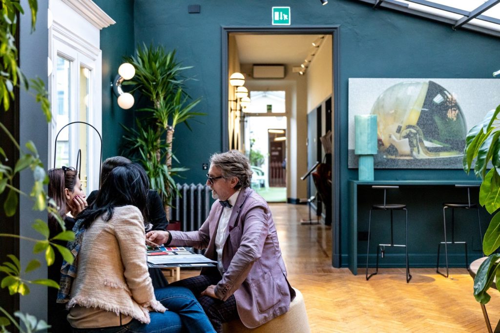
The new “Meet your Architect” format in collaboration with Archiproducts Ambassadors, Architects and Interior Designers selected by the Archiproducts team is kicking off at the 2021 edition. From September 4 – 10, customers and visitors can meet with Ambassadors at Archiproducts Milano to get free advice on Interior projects and design services – including the creation of mood boards and guidance in choosing furnishing accessories and finishes.

The meetings will be held by appointment in via Tortona 31. It is an unmissable opportunity for seeing and touching the materials and products in the showroom and for exploring all the products on sale on Archiproducts.com.

You can select the desired date, time and professional on the official event Calendly. If you can’t get to via Tortona 31, book your consultation online with Zoom. 

Archiproducts in the fashion district

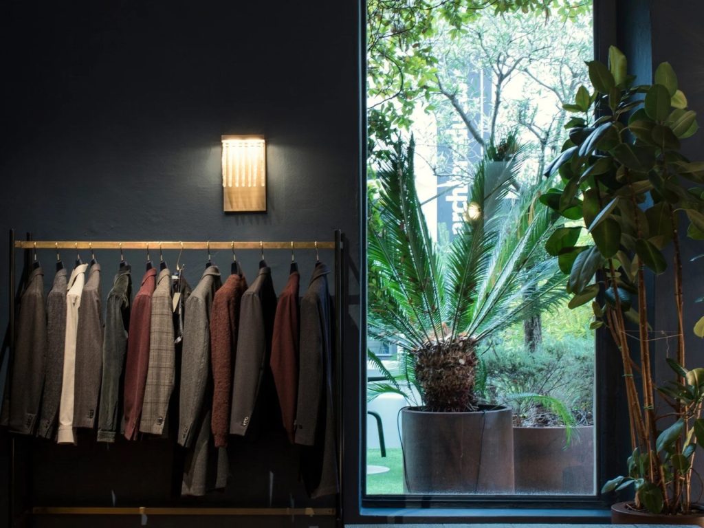
Archiproducts is also moving to the fashion district to present a brand new installation in the Boglioli storefront in via San Pietro all’Orto 17 in the centre of Milan. The entire selection of furnishings and accessories can be purchased online on Archiproducts using the “Shop the look” QR codes.

Don’t miss the appointment on 6 September: from 4 p.m. to 6 p.m. when the window displays will come alive in a dynamic setting that stages the “Future Habit (at)” concept, revealing the symbiotic relationship between people and their objects. 

“Montréal a Milano” … resonating the soul of the city

A selection of seven designers as part of a new design experience at Archiproducts Milano

In Toto x Montréal a Milano” will be part of the new design experience at Archiproducts Milano, during the Milan Design Week 2018. Curated by Montréal style icon and visual storyteller Azamit, the showroom is an ode to the city’s contemporary design essence: beautifully tormented and tinged with post-industrial melancholia. A selection of seven designers whose objects resonate the soul of the city.

— Atelier Zébulon Perron
— Claste
— D’Armes
— Foraine by Atelier Barda
— Lambert et fils
— Maison Milan
— Pascale Girardin

Montreal is beautifully tormented – Azamit explains – but it seems that it has found balance & harmony regardless of all the contradiction and the search for an identity, just like the two extreme weathers”.

As a special guest of Archiproducts Milano, the “In Toto x Montreal a Milano” showroom is comprised of two distinct installations that highlight the city’s extreme weather patterns. Carefully curated, the exclusively Montreal-designed objects are assembled to propose a journey through the lusciousness of long summer evenings, and the starkness of long winter days.

From the colder, angular lights of Lambert & Fils to the vibrant monochrome tints of Foraine by Atelier Barda and the unexpected plays on softness and rigidity by Claste and D’Armes… transcending notions of culture and place (Maison Milan, Pascale Girardin), and function and form (Atelier Zébulon Perron) – the collection suggests harmony in contradictions, and manages to bring warmth to undying winter days, and a fresh breeze to the relentless summer heat.

“Even though each designer has it’s own identity & design essence, each piece that was chosen had something that reflected the same effect in it’s finished product: fragile but yet strong, weightlessness but yet imposing, fluid but yet rigorous”, Azamit

Digital Interactions and Networking in a Real Place

Archiproducts shows the new home working look of the building located in via Tortona and opens the Touch Point of the online store

14/04/2017 – Connections, digital interactions and networking for a new ‘Design Experience’. All this in a real place – Archiproducts Milano – where architects, designers and brands can find their inspiration, seize opportunities and explore new synergies.

Since April 3rd the place has already welcomed more than 12 thousand visitors among architects, designers, brands and international press. Milan Design Week 2017 was the occasion to present the new look of the place, where since last year more than 15 thousand professionals have found their ideal home working space, but also to open the Archiproducts Shop Touch Point, the new microscopic but hyperinteractive shop window of the huge online store with thousands of products and brands on sale all over the world. The address is via Tortona 31.

Digital connections and interactions
If in 2016 the opening of Archiproducts Milano brought to an important transition from virtual to real, in the new year there has been a sort of coming back to the digital. All exhibited objects – both those giving shape to the workspace and those designing the ideal living space proposed in the shop – are ‘connected’ with the visitors. Thanks to digital instruments objects are able to ‘communicate’ with visitors, telling everything about their history.

This is what today is defined ‘Phygital’, a new passage from physical to digital in an osmotic synthesis in which these two worlds mutually contaminate. The connection between objects and visitors is possible thanks to the app ‘Archiproducts Scan’, allowing to ‘shazam’ the exhibited furniture. This releases a ‘cookie’ containing information on the features, versions, colours and prices, which are stored on the visitor’s device. In this way the visitor may have a look at those aspects offline, get to know the scanned products in detail and even buy them online.

“We are currently exploring a new retail concept – explains Enzo Maiorano, co-founder of the network – in which the product experience is more important than the mere visual knowledge: visitors can acquire much more information than those given by a single exhibited product. This is the first step of a path bringing visitors and objects closer, which is further developed with the help of technological devices. In this way also buying products online will be much easier”.

The new look of the building
Completely renewed both outside and inside, the new look of the of the spacious, luminous turn-of-the-century apartment was implemented thanks to the cooperation of 45 international brands.

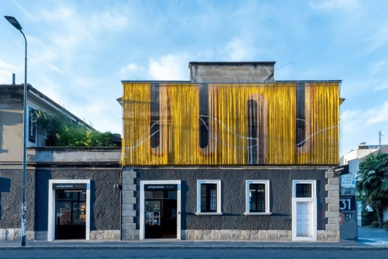
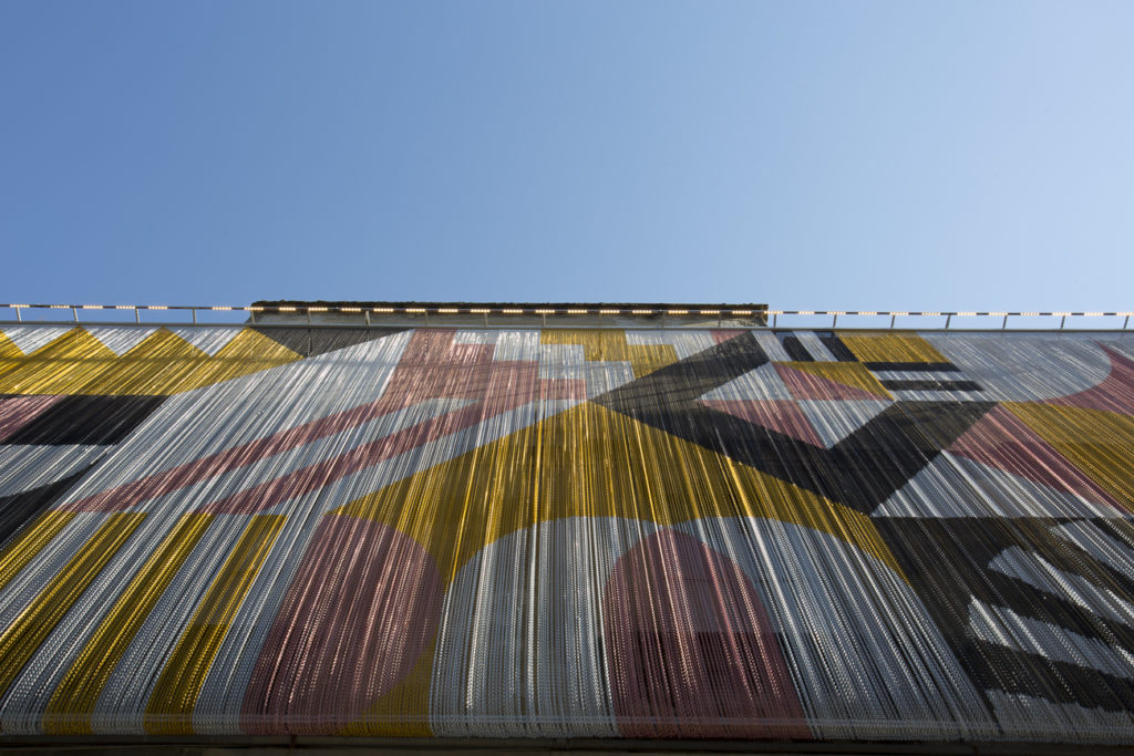
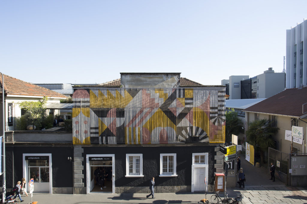
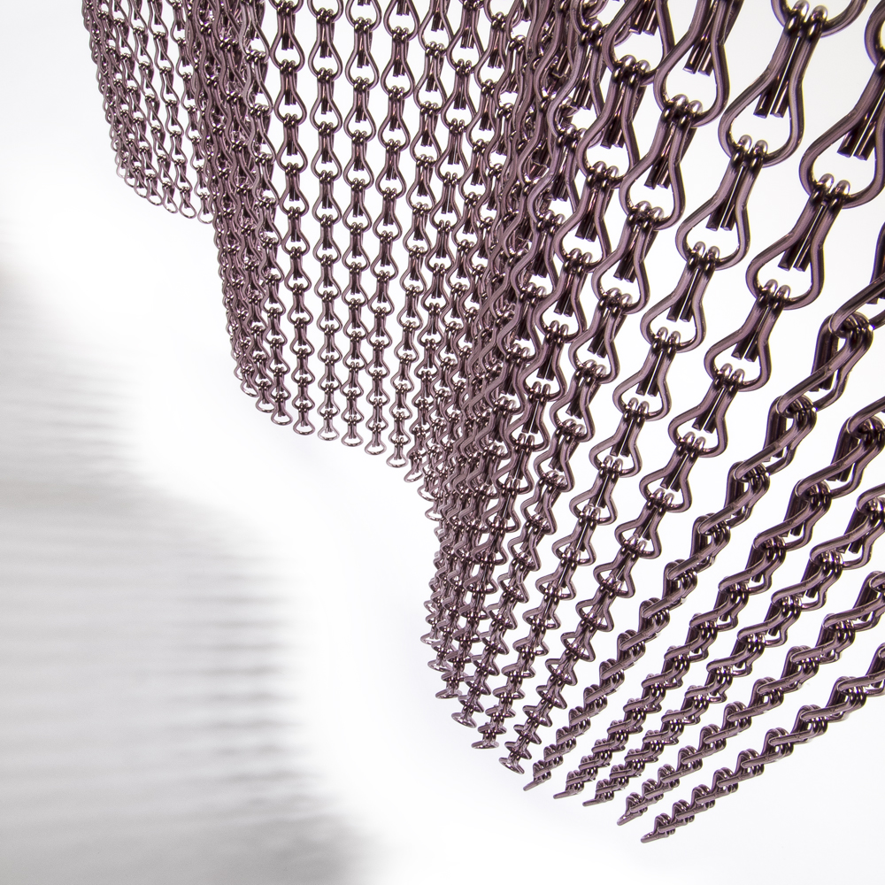
Hundreds of very light gold, black, pink-copper and silver Kriskadecor aluminium chains give rise to the new façade pattern, made upon a design by Serena Confalonieri, which stands out against the total-black background made by Oikos.

The path inside starts from the ground floor at the Archiproducts Shop Touch Point. A charming industrial space made precious thanks to the interventions by Ideal Work – which renewed the flooring using the Architop cement-polymer system laid by ASSOPAV – and by Knauf, which provided the dry construction system for the false ceiling in plasterboard made by Vanoncini, one of the biggest specialised companies in Europe.
The lighting system of the whole ground floor is made by Flos, with Infra-structure by Vincent Van Duysen, the first and currently the greatest installation since the system has been produced.
The archs connecting the different rooms are closed by Linvisibile full-height up-and-over doors.

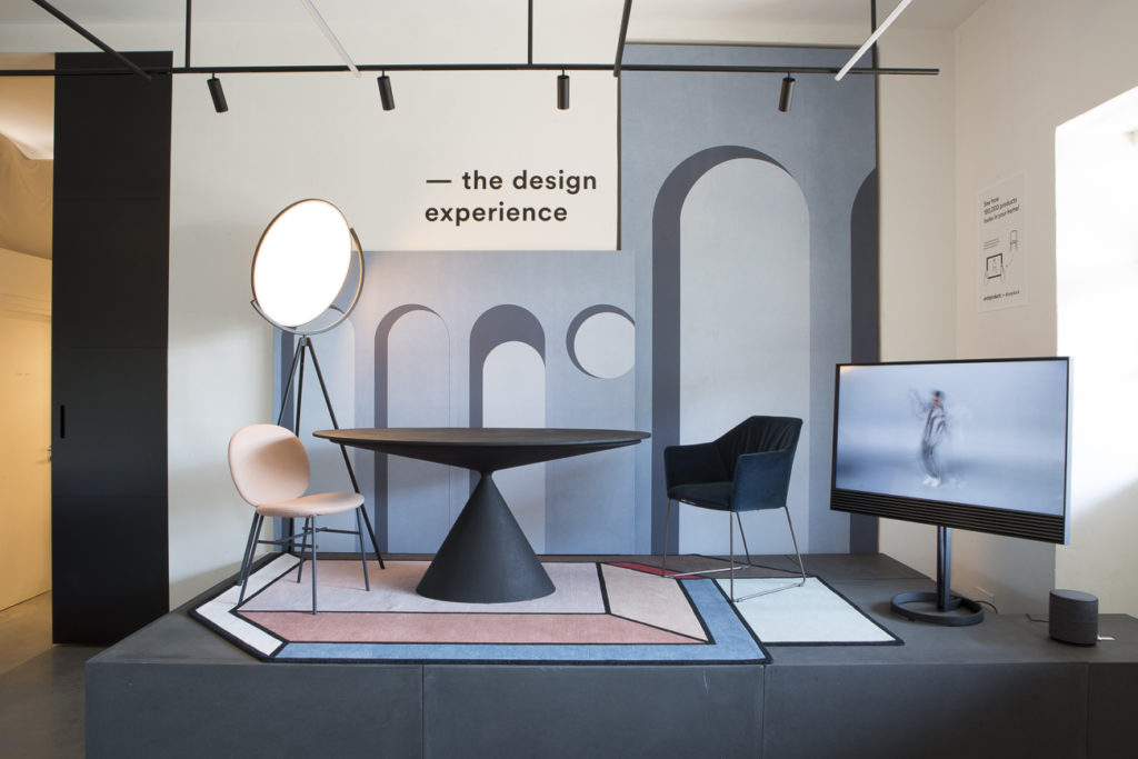
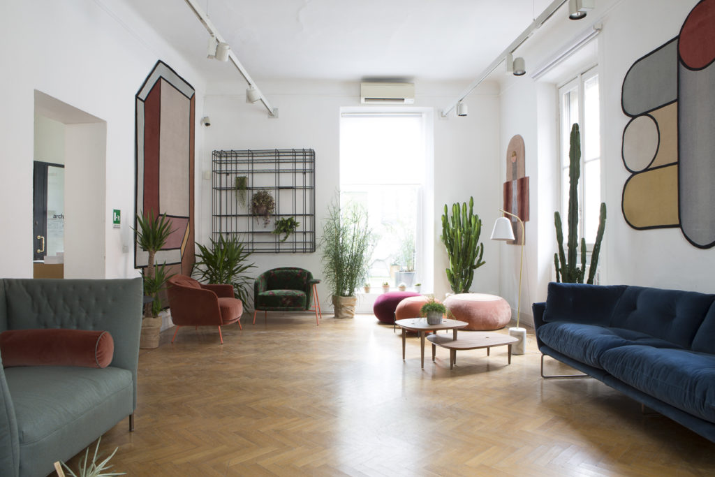
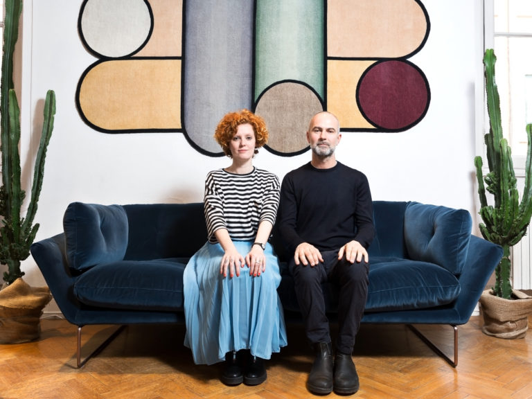
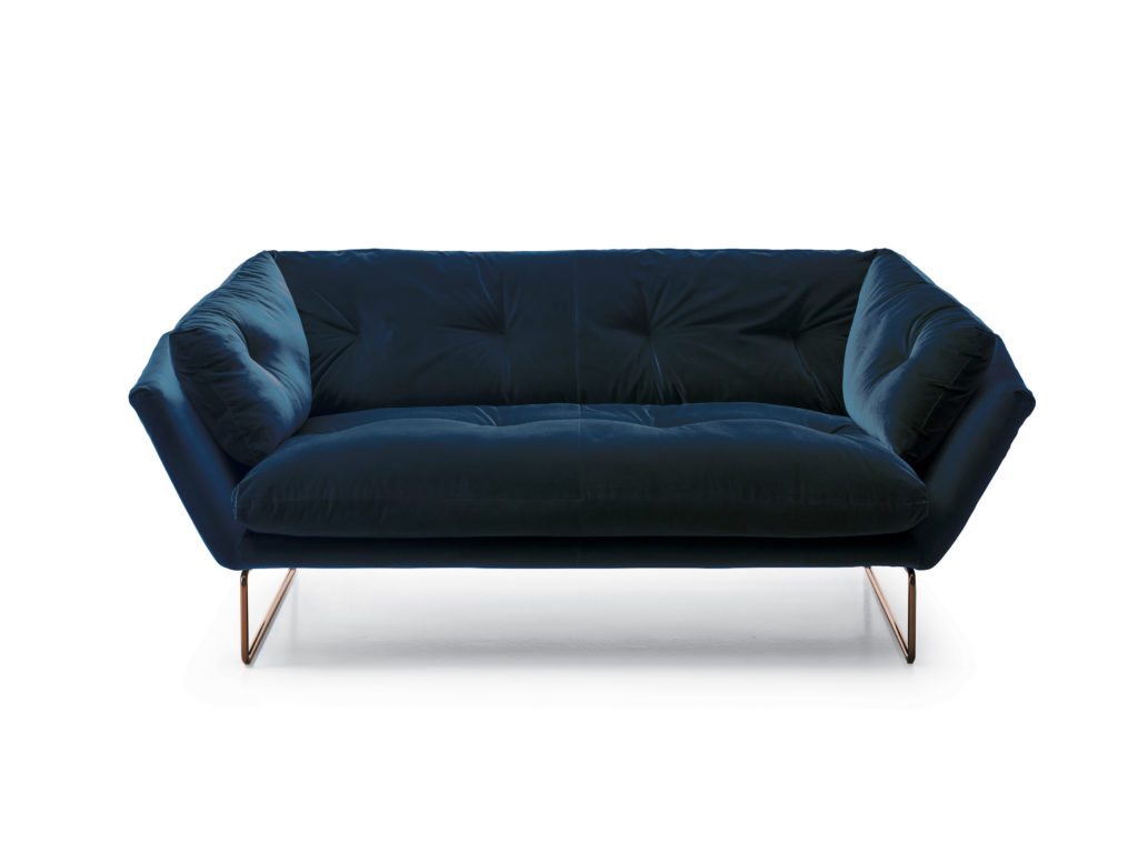
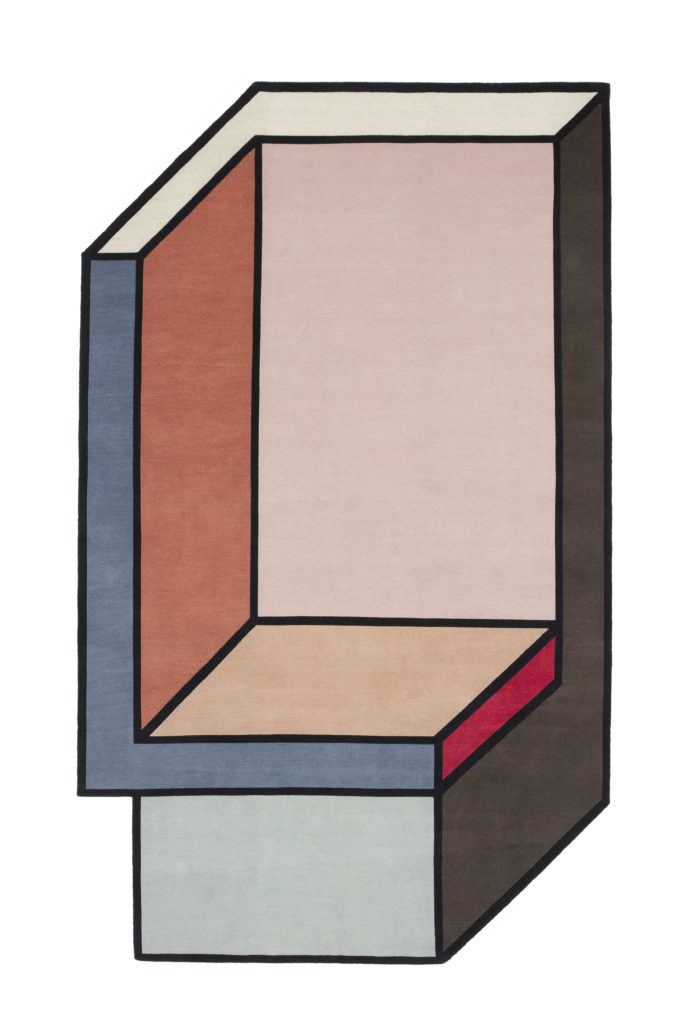
Here an ideal living space, furnished as a symbolic idea of home, shows the geometry with which Elisa Ossino has interpreted the vynil wallpaper by Texturae. The set also shows the new trends in the field of textiles: the precious blue velvet of the New York chair by Saba with the unprecedented combination of the copper-coloured structure. The powder pink of the façade pattern also finds its place inside with the new version of the Kelly C chair by Tacchini. All these colours are referred to on the Visioni B carpet by Patricia Urqiuola for cc-tapis and are perfectly matched with the lava stone and the new metal black, bronze and rust brownfinishes proposed by Desalto. The set also hosts a BeoVisionAvant TV screen by Bang&Olufsen projecting in real time the 3D visualization and contextualization in the set of any products selected from the archiproducts catalogue thanks to the Virtual Reality technology developed by Sayduck, startup of the Network.
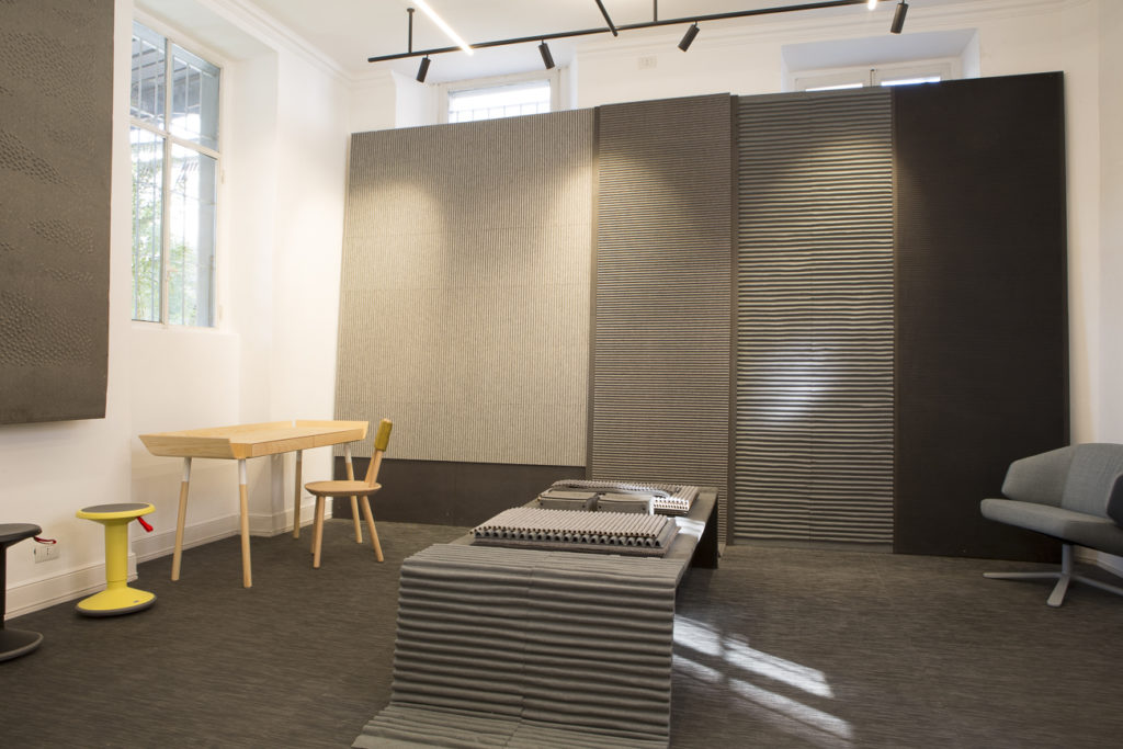
Always on the ground floor another workspace hosts the Buxkin noise-absorbing panels obtained by recycling the natural leather coming from the footwear industry, together with the Emko desks and chairs.

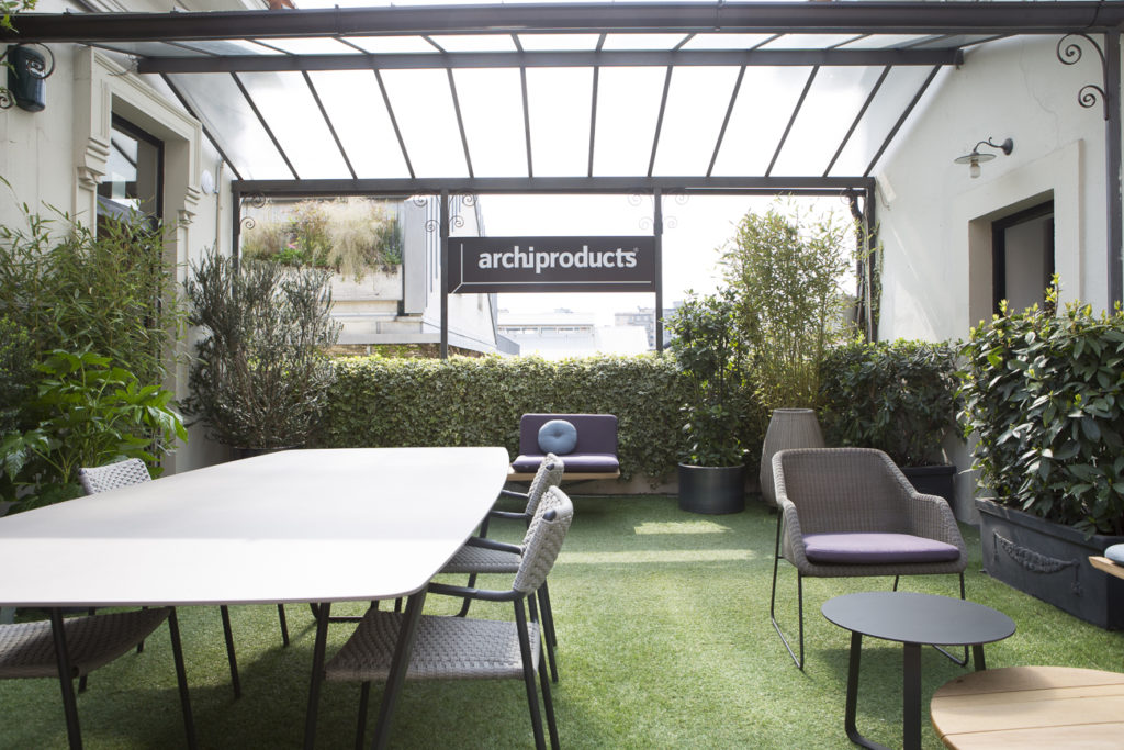
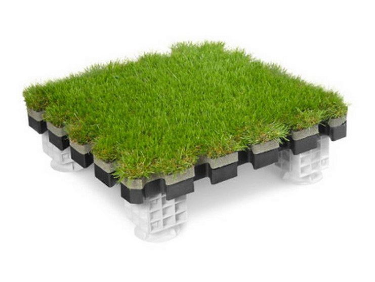
The staircase to the upper floor shows an unexpected outdoor space, covered by a green mantle, identical to natual grass, made with the revolutionary Roofingreen patent. The terrace is furnished with the new SAN collection by Manutti and the outdoor lamps by Bover.

A long corridor brings to the first room, furnished with the new collections by Saba Italia and the carpets by cc-tapis, hung on the walls like paintings. Their first co-branding project in a creative liaison in the poetry of colour and matter.

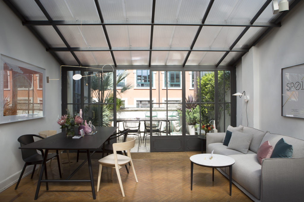
The corridor opens on a charming indoor-outodoor space, flooded with light from a window-roof and hosting the furniture of the Australian brand SP01.

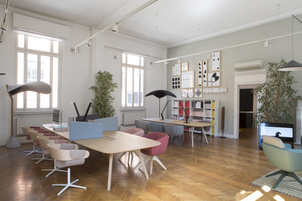
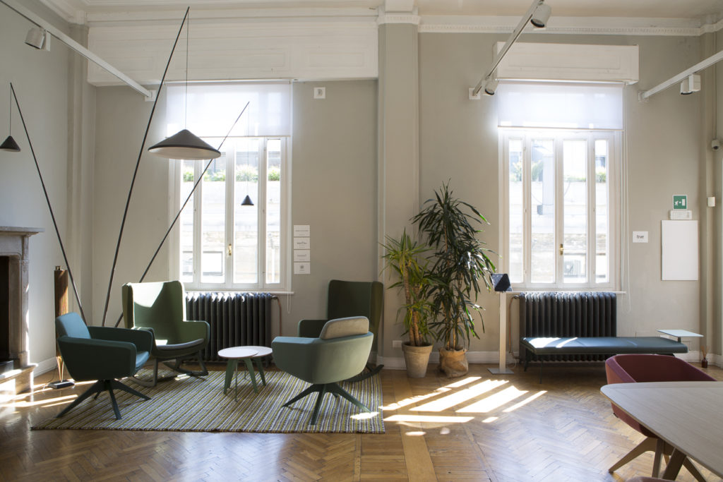
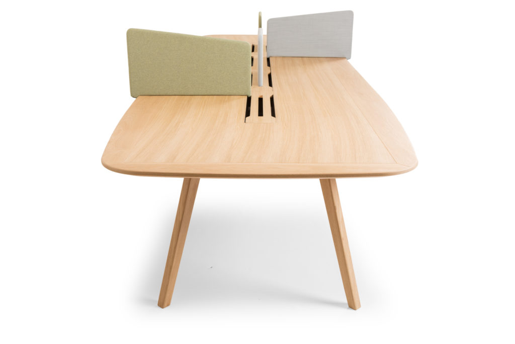
After passing this space, visitors have access to a wider room perfectly interpreting the idea of home working inside the project of Archiproducts Milano, with the furniture by True Design. Italian brand with a nordic style, it matches natural wood and textiles with very fine shades.

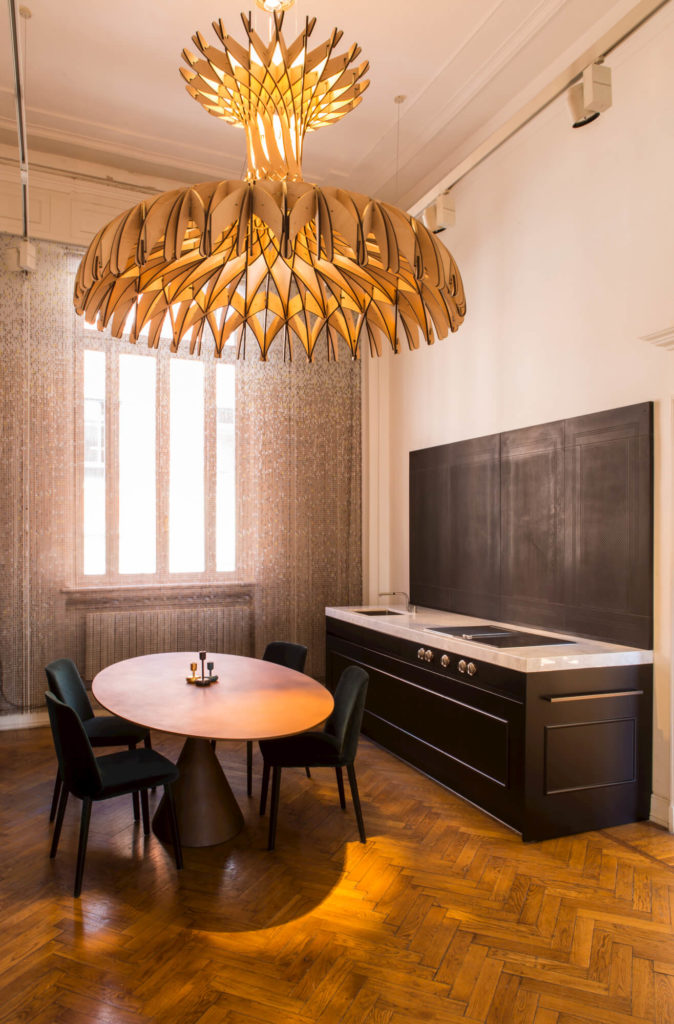
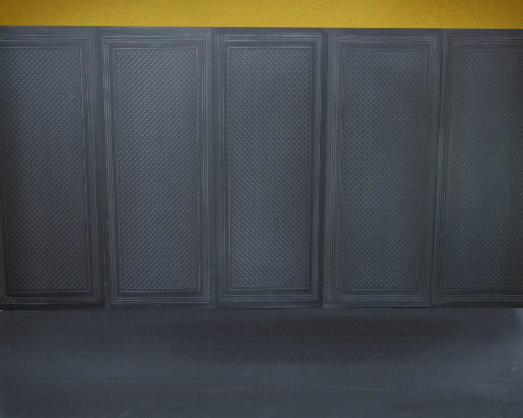
In a space meant to design a big house in which you can work or a welcoming workplace where you can feel like home, kitchen is a must. Specifically made by Strato, with elegant black columns reproducing the classic wood panelling design, the kitchen was used during the Milano Design Week by the recognised chef Enrico Bartolini for the gourmet dinners organised with Archiproducts. The wall of the kitchen top is covered with Trame di Pietra (transl.: stone textures), micro-engravings made on stone with a TWS-patented technology. The room is dominated by the Dome hanging lamp designed by Benedetta Tagliabue for Bover, lighting the Cley oval table by Desalto up, presented in the brand new rust brown finish. The stuffed chair covered in dark green velvet by Montis is perfectly integrated in the context.

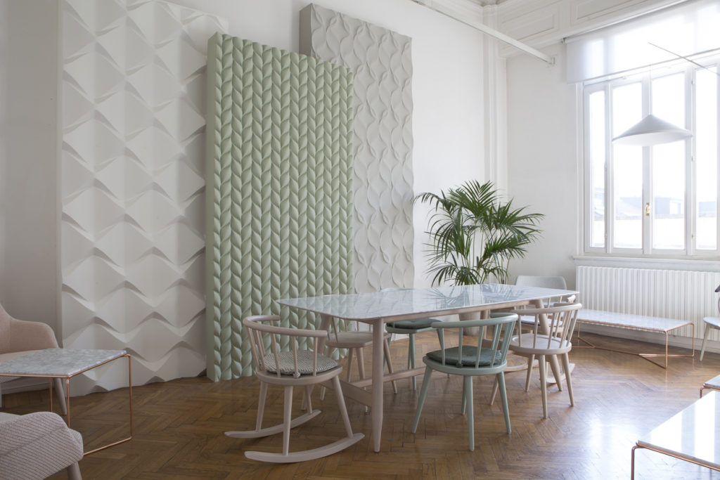
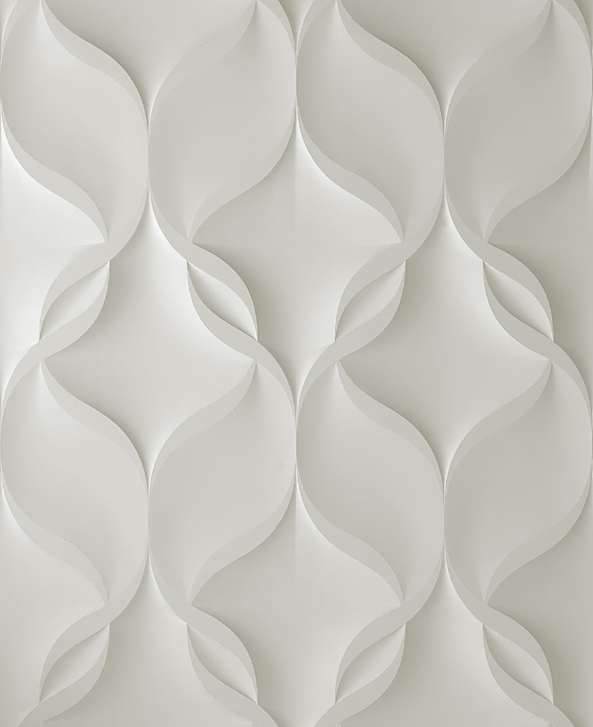
Billiani welcomes the visitors in the next room with wooden table and chairs, but also with comfortable armchairs and desks for more informal and relaxed meetings. Here it is possible to see the fiber-reinforced ceramic-plated mortar three-dimensional textures designed by Jacopo Cecchi 3D Surface with one’s own eyes.

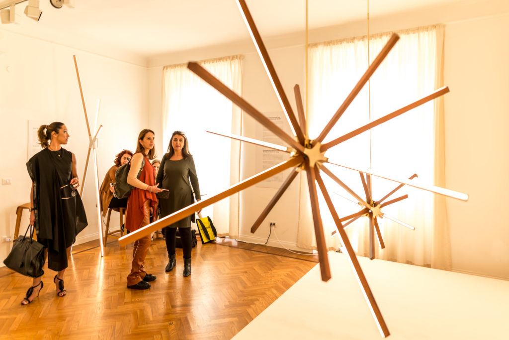
On the opposite side of the same floor two other rooms awai visitors. The first room hosts the brightful installation of the New York brand StickBulb. A combination of thin ‘sticks’ made with recycled wood, available from 30 centimetres up to 2 meters length, with a Led stripe on each. A special steel junction system allows to combine them, thus giving rise to different compositions.

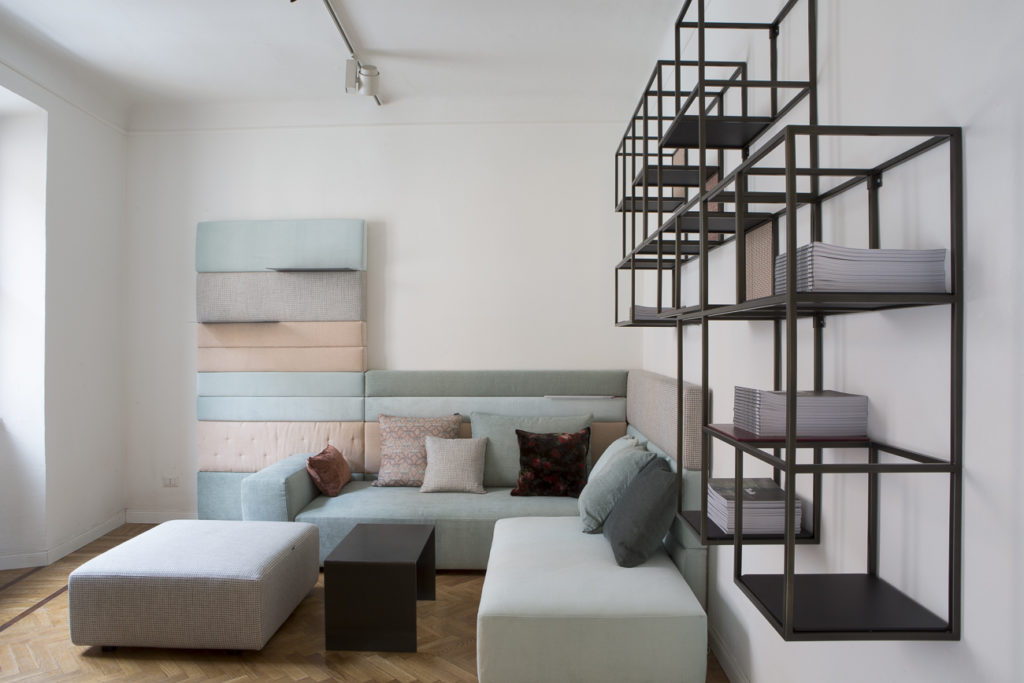
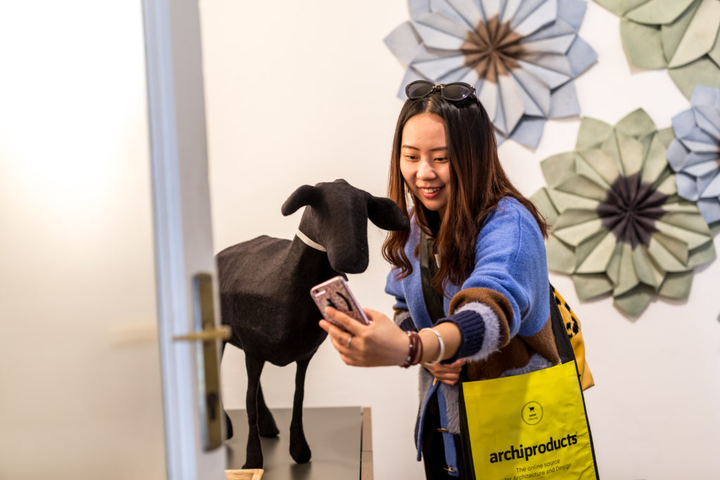
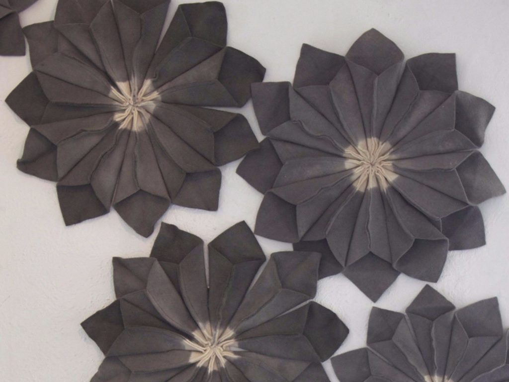
The second room hosts the SET Living system by Twils, presented in a new range of fine pastel shades. The same ones selected by Ronel Jordaan for the wool felt acoustic ornamental flowers decorating one of the walls.

Partner
Desalto, Saba Italia, Roofingreen, Buxkin, Velux, Bticino, Flos, cc-tapis, True Design, Oikos, Ideal Work, Knauf, Linvisibile, Mogs, TWS Trame di Pietra, Emko, Manutti, SP01, Texturae, Sciroccoh, 3d Surface, Montis, Twils, Billiani, Ms&Wood, Stickbulb, Bover, Strato Cucine, Bora, Frigo 2000, V-Zug, Sub-Zero, Jee-o, Luctra, Ronel Jordaan, Royal Botania, Falmec, Unical,
Bang and Olufsen, British Fires, Dsignedby, Sayduck

Technical Sponsors
Vittorio Martini, Kriska, Dieffebi, Smeg, Karpeta, Woodskin, Cea, Moab 80, Ethimo, Magis, Tacchini 

Media Partners
Elle Decor, Domus, Index Design Series, Downtown Design, Dubai Design District, Milano Space Makers, Openhouse

Archiproducts in via Tortona is Design Experience

Elle Decor interviews Enzo Maiorano, co-founder and art director of Archiproducts

13/04/2017 – Urban installation, exhibition event, digital interactions and virtual reality in the same location, Archiproducts Milano, for a new ‘design experience’. Elle Decor interviews Enzo Maiorano, co-founder and art director of Archiproducts, and the designer Serena Confalonieri, author of the new façade pattern of the building. Here the text of the interview by Caterina Lunghi.

Milan, Archiproducts in via Tortona 31. On an old façade, a cascade of small aluminium chains composing a graphic pattern of colours and shapes – gold, black, and pink – catches the eye of the visitors of the current edition of the Milan Design Week. It is Archiproducts’s business card for the Fuorisalone: architecture, design, digital world, and, of course, physical space. It is one of the liveliest communities in the international scene, and a reference point for companies, builders, and designers.

An online platform (Archiproducts), a space in Milan, in the heart of via Tortona (photo above), in front of the Mudec, and an app to see the products and the design objects also in 3D (Archiproducts Scan). The project is among the excellences of this year’s Salone del Mobile: an immersive and total experience in the design world.
Cofounder and art director Enzo Maiorano, and Serena Confalonieri, designer, author of the work on the façade, tell us more about it.
Let’s start from the exterior. Serena, can you explain to us the idea of the façade?
It is a composition of shapes and colours that represents the universe of Archiproducts.
I worked with architectural blocks, the same you use on Autocad: doors, arches, and other elements, on scale and on prospect. The design is the fruit of the combination of all these signs, and, through the colours, I came up with this abstract geometry.
Two levels of perception, the first is easy on the eyes and the second is for insiders?
Exactly, at every glance and in every corner you can find architectural elements. And I had to respect the Archiproducts’s identity, so I used yellow and black, its colours, and its language, that of architecture.
Enzo, why yellow and black for the identity of Archiproducts?
Because they are the colours of emergency and safety signs in construction sites. Our roots are in the construction business.
Enzo, let’s step back, can you explain to us the Archiproducts Milano space?
It is the arrival in town of Archiproducts, a shabby, without the ‘chic’, office! 800 Sq m and the concept is: once a year we empty the space, and we use it to show products and ideas of our associated companies, and in 2017 we present 40 of them. This new event at the Fuorisalone becomes the inauguration of the new setting for this year. A physical location that expresses the wide network of Archiproducts. It is Archiproducts online landing on Earth.
Let’s step even further back. You said: Archiproducts online landing on Earth…
Yes, Archiproducts is an online platform market place connecting producers and designers I founded 18 years ago with Ferdinando Napoli, to facilitate commercial relations between companies and professionals. We have thousands of participants, from technical products to decoration, lightning, walls, and furniture. And we also provide an e-commerce selection.
How do design and on-line work together?
Just think that we have a 1000% increase every six months. It is pretty much an avalanche.
And then this location… an opposite path, from online to the street…
Exactly, it is the path we are following: from the web to the city. Both are essential. We opened last year, we entrusted Diego Grandi with the façade (read also Archiproducts Milan Live, Work, Design). This is our second Fuorisalone, and we invited Serena Confalonieri to work on the exterior.
How does this space function during the year?
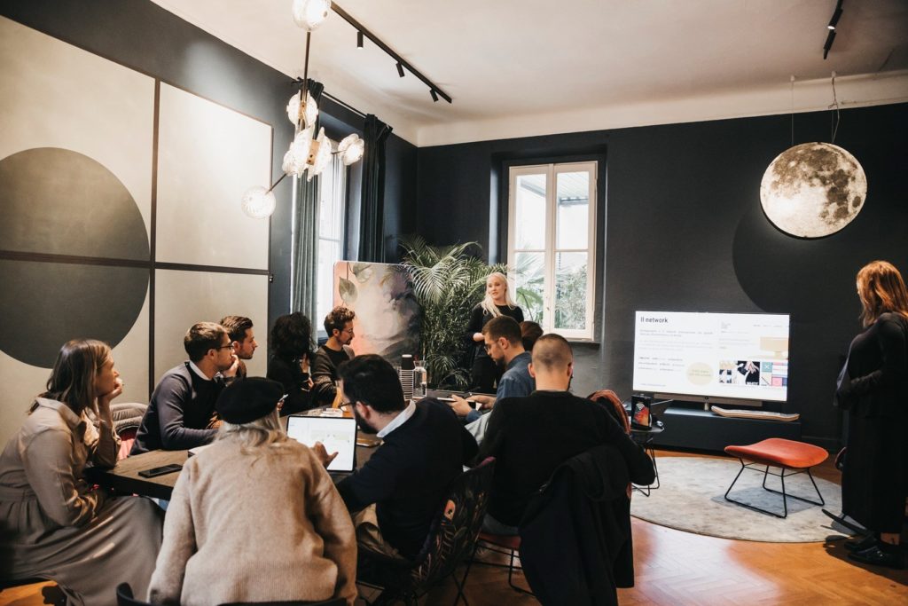
It is a showroom, but not just that: training, meeting, co-working, presentations. Designers can meet thousands of companies. The ground floor is dedicated to the launches of products you can then buy online: you can see and try them live and, with our partner Sayduck, we created the Archirproducts app, which works like Shazam, with details and information about the items.
So, it is another experience?
Yes, we also play with virtual reality and 3D, you can visualise the products within the rooms and arrange them before buying. Here is the theme of our Fuorisalone: The Design Experience. You come here and you can experience the products fully. This venue in Milan is only the first of a series of hubs.
You want then to broaden your horizons?
Yes, we already took an office at the Dubai Design District. In May, we’ll go to New York, we are scouting with Icff and New York City for Design for an American opening.
We are halfway through Milan Design Week. How is it going, Enzo?
We are in full swing, until yesterday (Wednesday, ed) we had more than 5,000 visitors. Last year, for our debut, we received unanimous support, but this year is even better. And also the Duetti/Duelli (Duets/Duels) we host everyday are going extremely well.
Duetti/Duelli… its sounds captivating… what is it about?
These are chess games on drawing, graphic performances: a project in balance between design and drawing curated by our friends Francesco Moschini and Francesco Maggiore for A.A.M. Architettura Arte Moderna. Architect Vincenzo D’Alba, armed with pencil and paper, deals with many other creatives, so far we had for example Marc Krusin, Paolo Rizzatto and Atelier Biagetti. The next round is scheduled for the morning of April 7, with Antonio Marra; we are then expecting Mario Bellini and Stefano Giovannoni… and maybe, if he can make it, also Tom Dixon will come over.

Materials, Colours and Aesthetic Experimentations

A full immersion on the topic at Archiproducts Milano

30/03/2017 – The knowledge of the several materials is without any doubt a key element of design, both as for the shell of a structure and for its interior design. Finding new materials able to produce new and multi-faceted expressive languages means having a fundamental instrument to give identity to a project. The 2017 edition of Archiproducts Milano, “The Design Experience”, offers a full immersion on the topic with several new solutions which could be analysed in depth.

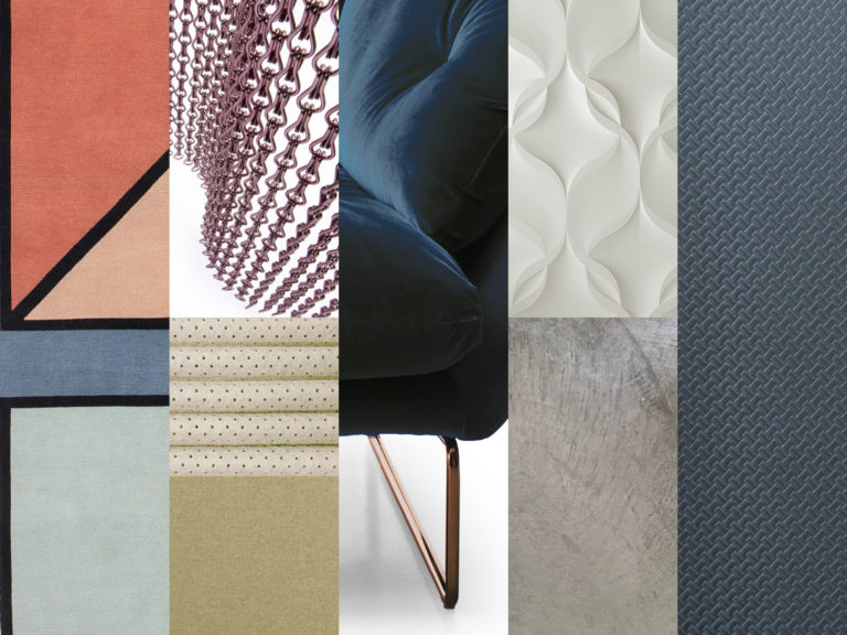
Cement resin, paints, aesthetic experimentations on marble and stone, three-dimensional surfaces, synthetic grass, recycled leather for acoustic insulation, new metal finishes, geometrical effects on wallpapers, spectacular coatings in aluminium chains up to the new trends in the field of textiles. From April 3rd all this will take shape in the new setting of the bulding at via Tortona 31 inside the rooms dedicated to home working, lighting, living and outdoor open to architects all the year round.

The revelation will appear before entering the building. The new total black look of the façade will show one of the solutions pertaining to colours and matters by Oikos: an environmentally friendly coating of compact materials made up of special silanized siloxane acrylic resins in water dispersion, which also meets the needs of thermal insulation and energy saving.

By looking up you can enjoy the new pattern of the façade, made on a design by Serena Confalonieri, with hundreds of very light anodized aluminium chains Kriskadecor and coloured in gold, black, pink-copper and silver.

Kriskadecor

The path inside starts from the ground floor at the Archiproducts Shop Touch Point. A charming industrial space made precious thanks to the interventions by Ideal Work, which renewed the flooring using the Architopcement-polymer system, and by Knauf, which provided the dry construction system for the false ceiling in plasterboard made by Vanoncini, one of the biggest specialised companies in Europe.

Here an ideal living space, furnished as a symbolic idea of home, will show the geometry with which Elisa Ossino has interpreted the vynil wallpaper by Texturae. The set will also show the new trends in the field of textiles: the brick-coloured velvet of the New York chair by Saba, which is proposed in a precious blue velvet on the upper floor, with the unprecedented combination of the copper-coloured structure; the powder pink of the façade pattern inside, with the new version of the Kelly C chair by Tacchini. All these colours are referred to on the Visioni B carpet by Patricia Urqiuola for cc-tapis and are perfectly matched with the lava stone and the new metal black, bronze and rust brownfinishes proposed by Desalto.

Buxkin

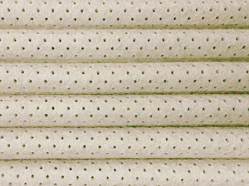
By turning the recycled natural leather coming from the footwear industry into noise-absorbing panels Buxkin will show how functionality can also meet aesthetic needs and find interesting solutions for wall and flooring coatings.

Ronel Jordaan adopts the same approach by proposing wool felt acoustic ornamental flowers.

Ronel Jordaan

It will not be easy to understand if the grass covering the terrace on the first floor is real or not. It will also not be easy to understand it even if the weather allows to walk barefoot! And it will be surprising to discover that beyond that natural softness there is the revolutionary Roofingreen patent: a single green mantle, identical to natural grass, which offers the advantages of an easy maintainance and durability of an industrial product.

Roofingreen

The three-dimensional surfaces will almost be a leitmotif: from the textures in fiber-reinforced ceramic-plated mortar designed by Jacopo Cecchi for 3D Surface to the Wood-Skin ‘digital’ patent, a smart composite material with endless applications, going through the ‘Trame di Pietra’ (transl.: stone textures), micro-gravings on marble and stone able to create very fine worked surfaces as textiles.

3D Surface

TWS

Marble is also used in furniture, combined sometimes with natural wood, sometimes with metal. It is one of the materials chosen for the remake of the Marcel table, designed in 1974 by the Japanese master Kazuhide Takahama for Billiani.

Natural wood is a common element to all rooms of the building: from the collections of the Australian brand SP01 through the working spaces created by True Design with a Scandinavian-brand mood, but which is completely made in Italy, to the furniture by Ms&Wood.

Save the date! From April 3rd at Archiproducts Milano, via Tortona 31.

True Design

Saba Italia

cc tapis


Do you want to visit the building, organize an event or tell us about your project?


Or fill out the form and we’ll get in touch with you as soon as possible

    * These fields are required.

    SUBSCRIBE TO OUR NEWSLETTER

    Stay updated to events, new products and promotions

    About

    Archipassport | Edilportale | Archiportale | 
    Archiproducts | Archilovers are registered trademarks of Edilportale.com Spa © Copyright 2024

    Contact us

    Via Tortona 31
    Monday – Friday
    9:00 – 13:00
    14:00 – 18:00


    Copyright 2024 – Archiproducts Milano